

Vynlox
Founder, Vynlox
Most Australian service businesses have websites. Very few have converting websites.
There is a difference. A beautiful website and a converting website are not the same thing. One looks good in a pitch deck. The other fills your pipeline.
This is not about aesthetics. This is about structure. A converting website has a specific anatomy. It follows a hierarchy of friction reduction, trust building, and clear action. Miss any of these elements and you lose leads you have already paid to acquire through SEO or ads.
Free quote · No obligation
Want a website that actually converts?
We'll review your current site (or sketch out a new one) on a free 30 minute strategy call.
Book a Free Strategy CallThis guide breaks down the seven structural elements that separate websites that convert from websites that merely exist.
1. Above-the-fold clarity: one hero, one value prop, one CTA
The first five seconds matter. When a visitor lands on your site, they need to answer one question in their head: "Is this for me?"
Most websites fail here. They bury the value proposition under a carousel of rotating banners, generic stock imagery, or worse, a video background that takes 3 seconds to load on mobile. Nobody waits. Nobody scrolls if the hero does not make a clear promise.
A converting hero has three elements:
Headline: Not the company name, not a tagline about "results-driven solutions". A specific, single promise that maps to what your visitor searched for or is feeling.
Bad: "Your trusted digital partner" Good: "Get more plumbing leads without spending on Google Ads"
Subheading: One sentence that expands on the promise. Remind them why they clicked.
Bad: "We deliver excellence across digital channels" Good: "Most plumbers in Sydney fight to be found online. We build sites that rank in Google and convert visitors into booked jobs."
Primary CTA button: One button. One colour. One action. No secondary navigation, no multiple buttons. If you have two CTAs fighting for attention, you have lost the reader.
If you are unsure what the primary CTA should be, ask: "What do I want this visitor to do in the next 10 seconds?" The answer is usually: get a free proposal, book a consultation, or call you. Not: "explore our work", "learn more", or "see our portfolio". Those come later.
This is where our website-design process starts. We do not build carousels. We build clarity.
2. Social proof placement: logos, testimonials, and case studies early
Trust does not build on its own. You have to place it strategically.
After the hero, a visitor is still deciding: "Do I believe this agency/business can help me?" This is where social proof lives. Not at the bottom of the page. Early.
The hierarchy of social proof, from weakest to strongest:
| Proof type | Signal | Timing |
|---|---|---|
| Client logos | "Recognizable brands have used them" | Hero section (3 to 5 logos, no scroll required) |
| Testimonials | "Real people say good things" | Section 2, before deep scroll |
| Measurable results | "They have proof of outcomes" | Section 3 (e.g. "22 leads in 90 days, $0 ad spend") |
| Case study summary | "Here is exactly what we did and what happened" | Section 4 or linked from hero |
| Guarantee | "They stand behind the work" | Mentioned early if strong (rare) |
The mistake most Australian service businesses make: they bury the social proof until page three. By then, 60% of visitors have bounced.
This is exactly what we did for Switch Accounting (visit them at switchaccounting.com.au). Their old site was all about the team. Their new one leads with "We have helped 200+ accountancy firms get more clients." Same business. Different result. They now get qualified leads every week without asking for referrals.
Place social proof where visitors can see it without scrolling. Logos first. Then real testimonials with photos and names (not initials or "A, Sydney"). Then one flagship case study or result. That is the trust ladder. Build it in the right order and conversions double.
3. The structure of sections: problem, solution, outcome, CTA
Below the hero and social proof, your site needs rhythm. Most sites meander. They list services. They talk about the team. They show "our process" as an abstract flowchart nobody understands.
A converting site has a repeating section structure:
Problem statement (what visitors are feeling or struggling with) Solution (what you do to fix it) Outcome (what happens after you fix it) Call-to-action (what to do next)
This pattern works because it mirrors how people make decisions. They think: "I have a problem. Can you solve it? What happens if I say yes? What do I do now?"
Bad section structure: "Here are our three service packages. Each is fully customizable. We also offer ongoing support."
Good section structure: "Most dentists in Australia get zero referrals from their website. This is because the website does not make it easy for past patients to recommend them. We rebuild your site with a referral section, staff bios, and a one-click "refer a friend" form. The result: one dentist in Perth went from 2 to 8 referrals per month. If you want your practice to do the same, get a free proposal."
The second version is longer. It is also 10x more likely to convert. Every section on a converting site follows this pattern. Problem. Solution. Outcome. CTA.
When you look at our website-design work, you will notice we do not show you pretty mockups first. We show you the structure. The structure is what moves conversion needles. Aesthetics follow.
4. Friction reduction: forms that do not feel like spam traps
Most website forms kill conversions. They ask for too much. They trigger spam filters. They do not make it clear what happens next.
A converting form asks for three fields, maximum: name, email, and a one-line message about what they need. No company name, no phone number (offer it as optional if you must), no dropdown for "how did you hear about us". Every extra field is a visitor who abandons.
The form should:
- Appear after the visitor has seen enough social proof to feel safe
- Have a single primary button with clear text ("Get a free proposal", not "Submit")
- Show a success message immediately (not send them to a blank "thank you" page)
- Trigger a confirmation email within 2 minutes
- Not require JavaScript to load the page (AKA the form should not break if a CDN script fails)
This is the difference between forms that feel like a friction trap and forms that feel like a conversation starter. A friction trap asks "Company name?", "What is your role?", "How many employees?" A conversation starter asks "What would you like us to build?" and stops.
If you want a form that actually converts, here is how we reduce friction on every project we build.
5. Page speed: not an afterthought, a conversion driver
A website that loads in 2 seconds converts 40% better than one that loads in 4 seconds. This is not marketing copy. This is measurable.
Australian internet speeds have improved, but mobile speeds are still a bottleneck. If your site takes more than 3 seconds to load on a 4G connection, you lose visitors.
Speed kills conversion because:
- Carousels (image galleries that rotate) add 200 to 400 KB and distract from the CTA
- Video backgrounds add 2 to 5 MB and few visitors ever press play
- Unoptimized images can bloat a page by 3 to 8 MB
- Analytics scripts, chat widgets, and ad tracking pixels add latency
A converting site is built with speed in mind from day one. This means:
- Images are optimized (WebP format, responsive sizes, lazy-loaded)
- No carousels (use static hero images instead)
- No video backgrounds (use a static image with a play button if video is essential)
- JavaScript is minimal (no jQuery, no unused frameworks)
- Fonts are system-first (custom fonts loaded via Google Fonts are fine; stick to 2 weight variants maximum)
This is why we measure conversion rate per second of load time on every project. A 1-second improvement translates to measurable lead-volume increases. This is exactly what we did for RyRo Loan Centre. We rebuilt their site. We cut load time from 4.2 seconds to 1.8 seconds. Their bounce rate dropped 30%. Leads increased 22 in 90 days, $0 ad spend.
Speed is not a nice-to-have. It is a conversion lever.
6. Mobile-first design: not responsive, mobile-first
Most websites are built for desktop first. They look "okay" on mobile. A converting website is built for mobile first, then expanded for desktop.
This matters because 70% of your traffic is mobile. If mobile is an afterthought, you have designed for the wrong audience.
Mobile-first means:
- One column layout (stacked sections, never side-by-side)
- Tap targets sized for thumbs (minimum 48x48 pixels for buttons)
- Form fields that trigger the keyboard properly (type="email" for email fields, so the browser shows the @ symbol)
- No hover states (mobile does not support hover; all interactions must work on tap)
- Fast touch feedback (button changes colour on tap immediately, not after 300ms delay)
A desktop-first site often breaks on mobile. Text overflows. Buttons are too small. Forms are hard to fill. A mobile-first site works everywhere.
If you test your site on a mobile phone and anything feels cramped, slow to tap, or unclear, your site is not mobile-first. It is mobile-responsive. There is a difference.

7. Measurement and iteration: you can only improve what you measure
A converting website is not static. It is a machine you measure and refine over time.
Most Australian service businesses build a site, launch it, and ignore it for three years. They wonder why leads do not increase. A converting site is measured from week one.
You need to track:
- Traffic source (organic, direct, ads, referral)
- Form completion rate (what % of visitors fill out the form)
- Form submission rate (what % of forms actually send)
- Lead quality (which pages send the best leads)
- Time on page (where do visitors lose interest)
- Bounce rate by page (which pages do not perform)
Most sites never measure these. They just guess. "Traffic is up!" Great. But did form submissions go up? Did the quality of leads change?
A converting site uses SEO as a channel to fill the asset. You build a site. You fill it with qualified traffic via SEO. You measure conversion rate. You iterate on the conversion rate. You do not build a new site every year. You refine the existing one.
This is the pattern we use on every project. Build. Measure. Refine. Repeat.
Putting it together: the converting website checklist
A converting website has:
- One clear value proposition in the hero (not a carousel)
- Social proof visible without scrolling (logos, testimonials, results)
- Problem-solution-outcome-CTA structure in every section
- Forms that ask for three fields maximum and show a clear success message
- Page load time under 3 seconds on 4G
- Mobile-first design (tap targets, single column, no hover states)
- Measurement dashboard tracking traffic, form completion, and lead quality
- Internal links to relevant service pages and related guides like our SEO for plumbers guide
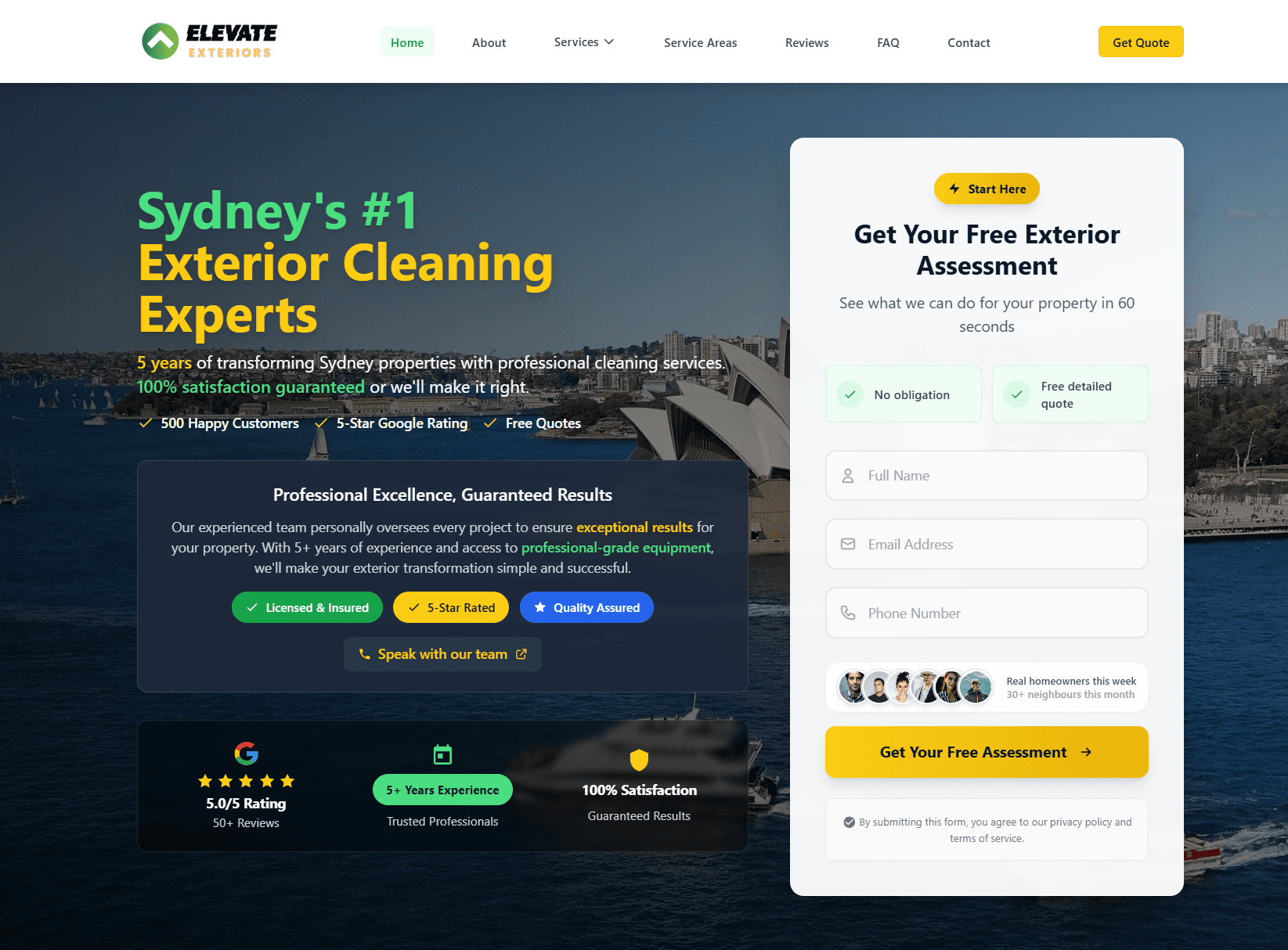
- One flagship case study visible early (bonus: like Elevate Exteriors, external link included)
- A clear next step for every visitor (CTA button, form, or phone number)
Most websites miss four or five of these. That is why they do not convert. This is not complicated. It is structure.

Real client. Real results.
Elevate ExteriorsExterior Services
Website rebuild + SEO foundations. After a 4 to 6 month build phase, now generating 15 to 20 qualified leads per month from organic search. No ad spend, lead quality consistently higher than paid traffic.
Quick answers
Frequently asked questions
Tagged with
Written by
Guru, Founder at Vynlox
Sydney based · 8+ years building websites · 100% client retention
I started Vynlox after watching too many good Australian businesses get burned by agencies that send reports, not results. Every strategy call you book is with me directly. You won't be handed off to a junior. You work with me.


