

Vynlox
Founder, Vynlox
A landing page is a single-purpose page built for one offer and one CTA. Most Australian businesses build them wrong. Here is the playbook that produces 5 to 10 percent conversion rates instead of 1 percent.
The difference between a landing page and a full website is stark. A website serves many audiences, multiple goals, and dozens of offers. A landing page serves one audience, one problem, one solution, and one call to action. No nav menu. No footer links. No distractions. Just the path from visitor to conversion.
If you are running paid ads (Google, Meta, LinkedIn), a landing page is not optional. It is the difference between a 12 percent conversion rate and a 0.8 percent one. In this guide, we will walk through the structure, copy, and design principles that work for Australian businesses. By the end, you will have the blueprint to build (or brief a designer on) a landing page that actually moves the needle.
Free quote · No obligation
Want a website that actually converts?
We'll review your current site (or sketch out a new one) on a free 30 minute strategy call.
Book a Free Strategy CallWhat makes a landing page different from a website
Most Australian businesses confuse landing pages with full websites. The two serve different purposes and need different strategies.
A full website is a multi-page asset. It covers your company story, all services, case studies, blog, and contact details. It is built for organic search, brand authority, and giving visitors all the information they need to make a decision over days or weeks. Websites rank in Google, build trust over time, and serve as the hub for all your inbound marketing.
A landing page is a one-page sprint. It has one headline, one offer, one problem to solve, and one button. There is no navigation, no footer, no blog links, no other offers. Every element on the page nudges the visitor toward the same conversion (a form fill, a phone call, a purchase, or a booking). A landing page does not rank in Google. It is not built for organic traffic. It is built for paid traffic and internal campaigns. You send people to it via ads, email, or a direct link, and it converts them fast.

The anatomy of a high-converting landing page
A landing page follows a predictable structure. Every section has a job.
Hero section (problem + headline + subheading + CTA). This is the first thing visitors see. The headline must answer the question in their head: "Why am I here, and is this for me?" Start with the problem, not the product. Bad: "Responsive Web Design." Good: "Your website looks great on desktop. It looks broken on mobile. Here is how to fix it."
The subheading expands on the problem. "Most Australian agencies charge $50,000+ to rebuild. We do it in 6 weeks for $18,000."
The hero CTA is a button that repeats the offer. "Get a free mobile audit" or "Book a 15-minute call." Not "Submit" or "Learn more." Be specific.
Social proof section. Visitors do not believe you until they see evidence. Show logos of companies you have worked with, review snippets, or client quotes. If you don't have reviews yet, a testimonial video from one happy client outweighs ten fake-looking star ratings.
Problem section. Go deeper into the problem your visitor came to solve. Be specific. If the page is about mobile-responsive design, show screenshots of a broken mobile experience. If it is about SEO, show search results where competitors rank above you.
This is where you start to earn trust. You know their pain because you have solved it for other Australian businesses.
Solution section. Once the problem is clear, introduce your solution. Show your process, your methodology, or your unique approach. This is where you differentiate from competitors.
Social proof (case study or result). If the page is for a specific service, embed a brief case study or result snapshot. Not a long story, just a before/after metric. "We took RyRo Loan Centre from 0 to 22 leads in 90 days with a $0 ad spend, multi-channel approach" is enough.
Objection handling. What is holding visitors back from clicking the CTA? Address the top two objections on the page. For a web design page: "Do I need to replace my whole site?" (No, we rebuild the parts that matter.) "How long will this take?" (Typically 4 to 8 weeks.)
Strong CTA section. Repeat the offer again with a button. Make it bold, high contrast, and hard to miss. Use a colour that stands out from the rest of the page. Vynlox uses fuchsia for a reason.
FAQ section. Answer the remaining questions. Keep answers short, one or two sentences each. This section also helps search engines understand what the page is about.
Copy that converts
Landing page copy is different from website copy. It must be direct, problem-aware, and focused on the reader's need, not your company.
Lead with the problem, not the product. Bad: "We offer responsive web design services." Good: "Your mobile traffic is dropping because your website looks broken on phones."
Use the reader's language. If your audience is accountants, talk about "compliance risk" and "client trust", not "digital presence." If your audience is tradies, talk about "getting more jobs booked" and "not wasting time on phone calls that go nowhere."
Build value before asking for anything. In the first three sections of the landing page, the reader should understand what problem you solve, how you solve it, and why it matters. Only then do you ask for a conversion.
Use numbers when you can. "Businesses that fix mobile load times see a 2.6 percent uptick in conversions" is better than "Mobile speed is important." Real numbers feel true.
Make the CTA button text match the reader's intent. "Get a free audit" is better than "Get started." "Book a call" is better than "Contact us." Use the specific outcome the reader will get.
| Landing page type | Best CTA button text | Best conversion offer |
|---|---|---|
| Paid search (Google Ads) | Get a free audit / Get a free quote | Audit, quote, or 15-minute call |
| High-intent traffic | Book a strategy call / Request a proposal | Proposal, strategy call, or trial |
| Low-intent traffic (cold audience) | Download our guide / Join our newsletter | Free guide, checklist, or email series |
| E-commerce | Shop now / Get 10 percent off | Discount, free shipping, or free trial |
Design principles for converting landing pages
The best landing page copy in the world will not convert if the design is cluttered, slow, or confusing.
White space is your friend. Do not fill every pixel. Each section should have breathing room. White space makes important elements stand out and signals professionalism.
Mobile-first design is not optional. Most of your visitors will be on mobile. If the page does not read well on a 375px screen, you have failed. Text should be 16px minimum. Buttons should be 48px tall (thumb-friendly). CTAs should be above the fold.
Images and video matter. A static page full of text will lose visitors. Use one image per section (but do not repeat the same image twice). If the page is for a service like web design, show a before/after comparison or a screenshot of a real client site.
Load speed is conversion gold. A one-second delay in page load time can drop conversion by 7 percent. Compress images, defer non-critical JavaScript, and use a fast CDN. Test with Google PageSpeed Insights.
Consistency in visual hierarchy. Use a clear hierarchy of type sizes and weights. H1 (main headline) should be the biggest. H2 (section heading) smaller. Body copy smaller still. Do not deviate.
Measurement: heatmaps, tracking, and testing
You cannot improve what you do not measure. Set up measurement before you launch.
Heatmaps tell you where visitors are actually clicking. Tools like Hotjar or Microsoft Clarity show you exactly where visitors scroll to, what they click on, and where they leave. Use heatmaps to find the weak spots on your page.
Conversion tracking must be set up on day one. Use Google Analytics or your email platform's built-in tracking to log every form submission, phone call, or other conversion event. After two weeks, you will have enough data to spot what is working.
A/B testing uncovers quick wins. Once you have 50 conversions, start testing. Try a different headline, a different CTA colour, a different offer. Change one element at a time and measure for at least 14 days. That one tweak could double your conversion rate.
For our website design work, we always start with a landing page strategy session. We audit the page, set up heatmaps and tracking, identify the top three conversion blockers, and test them one at a time. Over 90 days, that process typically increases conversions by 40 to 60 percent.
Landing pages vs full websites: which do you need?
You need both.
A full website is your anchor. It is built for organic search, brand, and long-term authority. It covers all your services, your team, case studies, blog, and pricing. It is where visitors land when they search "web design Sydney" or "SEO agency Australia."
A landing page is your sprinter. You use it for paid campaigns, email sequences, and specific offers. You point a Google Ads campaign to a landing page about "mobile website redesign", not your homepage. You send an email about "free SEO audit" to a landing page dedicated to that offer, not to your services page.
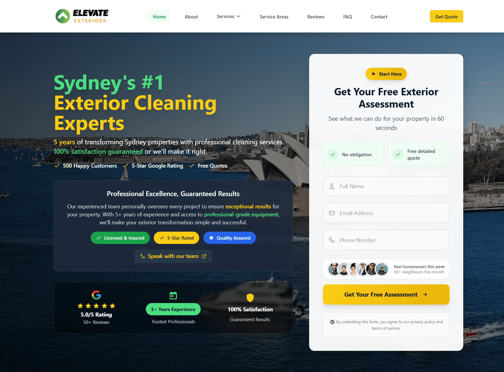
This is exactly what we did for Elevate Exteriors (you can visit them at elevate-exteriors.com.au). They had a strong full website for organic search, but their paid ads were sending people to the generic homepage. We built three landing pages, one for each of their core services. Conversions on paid traffic jumped by 260 percent in 60 days.
If you want a playbook for building or improving your landing pages, our web design retainer includes a landing page audit and optimisation phase.

Common landing page mistakes (and how to avoid them)
Mistake: too many offers on one page. If you offer web design, SEO, and branding on the same landing page, you will convert none of them. Pick one offer. Build a separate page for each service.
Mistake: generic stock photos. A generic "team shaking hands" photo tells visitors nothing. Use real screenshots of your work, real client photos, or specific visual metaphors that match your offer.
Mistake: no clear headline. "Welcome to our agency" is not a headline. A headline answers: "What problem do you solve, and who is this for?" Example: "Stop losing sales to a slow website. Get a free speed audit."
Mistake: buried or weak CTAs. The call to action should appear at least twice: once in the hero and once near the bottom. Use a bold, contrasting colour. Make the button text specific.
Mistake: no mobile optimisation. Test your landing page on a real phone, not just a browser emulator. Most visitors are on mobile. If the page stacks awkwardly or the button is hard to tap, you will lose conversions.
Mistake: no measurement. If you are not tracking conversions, you do not know if the page is working. Set up a simple conversion pixel or form submission trigger in Google Analytics before you launch.
How to get your landing page built
If you want to build this yourself, use tools like Unbounce, ConvertKit, or Carrd. They have templates and drag-and-drop builders that work well for straightforward offers.
If you want a custom landing page built to match your brand, integrated with your CRM, and optimised for conversion, book a call. We build landing pages as part of our web design retainer. We also run A/B tests and optimisation cycles to find your conversion sweet spot. Most clients see a 40 to 100 percent lift in conversion rate within 90 days.
The landing page is one piece of the conversion stack; the rest is your site, your SEO, and your AEO presence. We covered the compounding playbook in our complete dental SEO guide and our SEO playbook for plumbers.
Real client. Real results.
Elevate ExteriorsExterior Services
Website rebuild + SEO foundations. After a 4 to 6 month build phase, now generating 15 to 20 qualified leads per month from organic search. No ad spend, lead quality consistently higher than paid traffic.
Quick answers
Frequently asked questions
Tagged with
Written by
Guru, Founder at Vynlox
Sydney based · 8+ years building websites · 100% client retention
I started Vynlox after watching too many good Australian businesses get burned by agencies that send reports, not results. Every strategy call you book is with me directly. You won't be handed off to a junior. You work with me.


