

Vynlox
Founder, Vynlox
Why Your Website Isn''t Converting (And How to Fix It)
You''re getting traffic. Pages are loading. People are visiting. But they''re not converting.
The math on this is brutal. If your website receives 100 visitors a month but converts none of them, you''re leaving money on the table every single day. Let''s say your average customer is worth $5,000 in annual revenue. At a 2% conversion rate (pretty standard), you''d get 2 leads. At 0%? Zero. That''s $10,000 in lost revenue you''re not even fighting for. Multiply that across a year, and you''re looking at $120,000 in opportunity cost. All from a website that''s technically "working."
Free quote · No obligation
Want a website that actually converts?
We'll review your current site (or sketch out a new one) on a free 30 minute strategy call.
Book a Free Strategy CallThe problem isn''t your traffic. The problem is what happens when visitors land on your site.
This is where most businesses go wrong. They invest in SEO, paid ads, or referral networks to drive traffic, then wonder why the leads don''t follow. The culprit? A website that doesn''t convert. It''s like pouring water into a bucket with a hole in the bottom.
Here are the 10 most common reasons your website isn''t converting, and exactly how to fix each one.
1. Slow Page Load Speed
The symptom: Your homepage takes 3+ seconds to load. Visitors are already gone before they see your hero.
Why it kills conversion: Google research shows that 53% of mobile users abandon a site that takes longer than 3 seconds to load. By the time your page finishes loading, you''ve lost half your potential customers.
The fix: Run your site through Google PageSpeed Insights. If you''re scoring below 50 on mobile, focus on image compression, lazy-loading, and cutting unnecessary third-party scripts. A fast site is a selling site.

2. Weak or Generic Hero Section
The symptom: Your hero says something like "Welcome to our website" or "We''re a digital agency." No promise. No specificity.
Why it kills conversion: A visitor has 3 to 5 seconds to understand your value. If your hero doesn''t answer "Why should I care?" in that window, they''re bouncing to a competitor.
The fix: Your hero needs three things: (1) a clear problem statement ("You''re getting traffic but no leads"), (2) a specific outcome ("Turn more visitors into customers"), and (3) a visible next step ("Get a free website audit"). Make it crystal clear what you do and who it''s for.
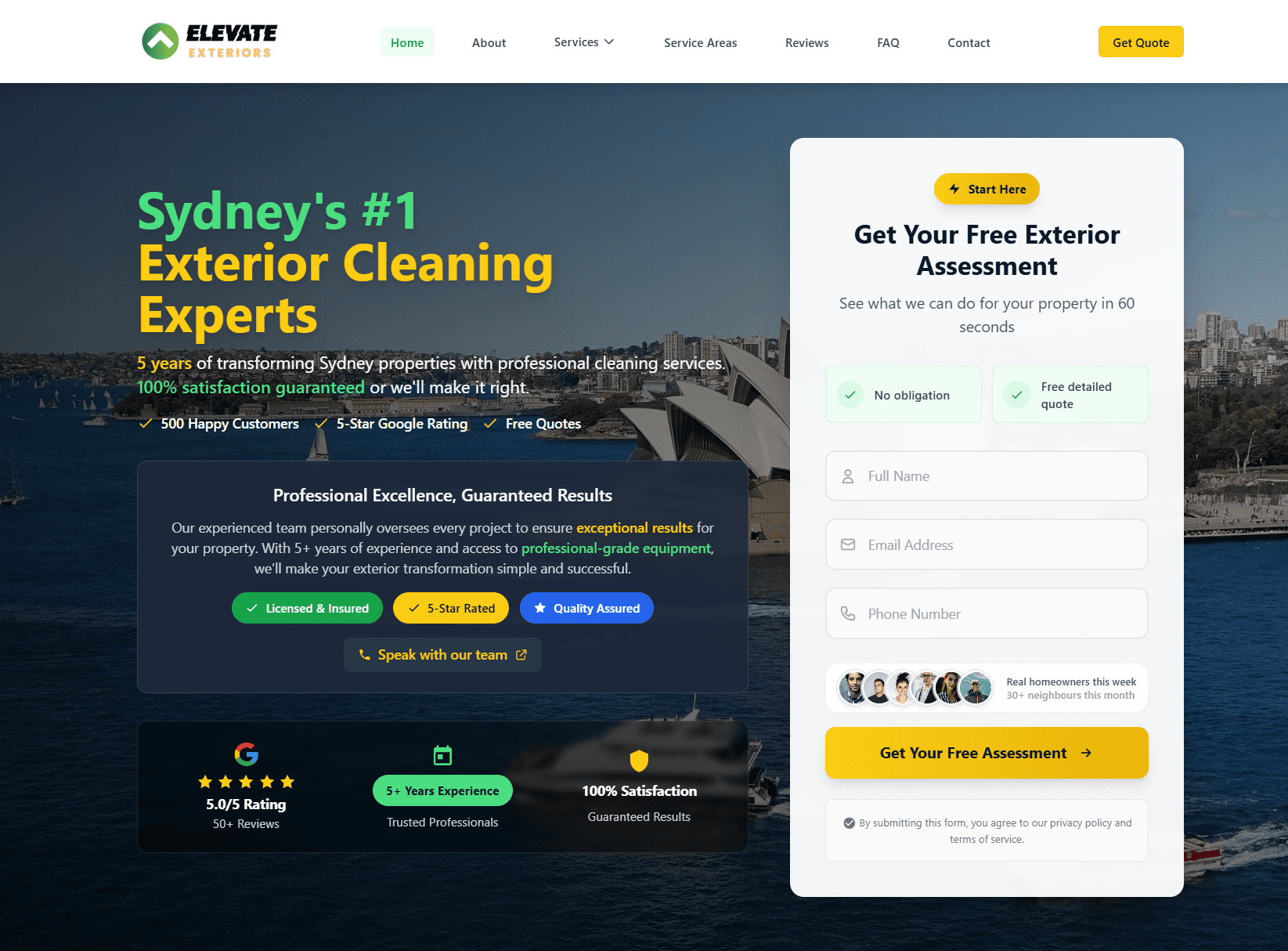
This is exactly what we did for Elevate Exteriors (you can visit them at elevate-exteriors.com.au). Their original hero was generic contractor language. We rewrote it to lead with results: "Generate 15+ qualified roofing leads per month." Visitors immediately understood the benefit.
3. No Clear Call-to-Action
The symptom: Visitors land on your site and have no idea what to do next. There''s a contact form somewhere, buried below the fold.
Why it kills conversion: Friction kills conversion. If a visitor wants to contact you but has to hunt for a button, most won''t bother.
The fix: Your primary CTA should be visible on every page, above the fold. Make it a button, not just a link. Use action language: "Get a Free Proposal," "Book a Consultation," "Start Your Audit." Repeat the CTA at least three times per page: in the hero, in the middle (or sidebar), and at the bottom.
4. Mismatched Offer
The symptom: Your website promises "web design" but the form asks for budget, timeline, and project scope. You''re asking too much too early.
Why it kills conversion: A visitor landing from a paid ad or referral has zero context. If your first ask requires them to commit time or think deeply, most will bounce.
The fix: Align your offer to the stage of the buyer journey. Top-of-funnel visitors should see low-friction offers: "Download our free website audit checklist" or "Get a 15-minute free consultation." Middle-of-funnel: "See how we built a case study." Bottom-of-funnel: "Request a formal proposal." One offer doesn''t fit all visitor types.
5. Hidden or Obscure Contact Information
The symptom: Your contact form is on the contact page, but there''s no phone number, email, or address anywhere else.
Why it kills conversion: Some visitors want to call you. Some want to email. Some just want to verify you''re real by looking up your street address. If they have to dig, you''ve lost them.
The fix: Make contact info visible in your header, footer, and on every service page. Include phone, email, and a physical address (if you have one). This builds trust and removes friction for buyers ready to move fast.
6. No Social Proof or Testimonials
The symptom: Your site talks about yourself. "We''re great. We''ve been in business since 2015. Our team is experienced." No one says this to verify you''re credible.
Why it kills conversion: Trust is currency. If you''re asking someone to hire you, they want proof other customers have done the same and been happy.
The fix: Publish 3 to 5 customer testimonials, ideally with photos and job titles. Bonus: include results ("We increased leads by 120%"). Build a case study section. Add logo grids of past clients. These signals tell the visitor, "Real businesses trust us."

7. Non-Mobile Responsive Design
The symptom: Your site looks great on desktop, but on mobile it''s broken. Text is tiny. Buttons are hard to tap. Forms don''t work.
Why it kills conversion: Over 60% of web traffic is now mobile. If your site doesn''t work on phones, you''re losing the majority of your potential customers.
The fix: Test your site on iPhone and Android devices. Buttons should be at least 48 pixels tall. Text should be 16px minimum. Forms should auto-fill phone numbers and emails where appropriate. If you''re unsure, hire a web designer to audit your mobile UX.
8. Broken or Confusing Forms
The symptom: Your contact form has 15 fields. Half of them are optional. The submit button doesn''t look clickable. Error messages are unclear.
Why it kills conversion: Every form field adds friction. Most visitors won''t fill out a long form on mobile.
The fix: Ask for 3 to 5 fields maximum on your primary form. Name, email, message. Optional: phone, company. Auto-detect and pre-fill country and time zone. Make the submit button look clickable (use a contrasting color). Show success messages clearly.
| Form length | Conversion rate |
|---|---|
| 3 fields | 25-30% |
| 5-7 fields | 10-15% |
| 10+ fields | 2-5% |
Fewer fields win. Always.
9. Page Bloat and Distraction
The symptom: Your homepage is 10,000 words with 6 different CTAs pointing to different pages. Navigation is cluttered with 20 menu items.
Why it kills conversion: Too many options paralyze the visitor. If you''re asking them to choose between "Learn More," "Get Started," "Download," and "Contact," they''ll choose to leave.
The fix: Focus your homepage on one primary conversion goal. Ruthlessly cut anything that doesn''t serve that goal. One CTA per section. One primary navigation menu (a "Services" dropdown, not 6 separate service pages linked from the nav).
10. Generic or Weak Copywriting
The symptom: Your site uses placeholder language. "We''re a full-service agency." "We deliver results." "Contact us today." Flat. Forgettable. Zero personality.
Why it kills conversion: Buyers don''t hire companies. They hire solutions to their problems. If your copy doesn''t speak to their pain, it doesn''t resonate.
The fix: Write like you talk. Use the reader''s language, not industry jargon. Be specific about what you do. "We''re a web design agency" vs. "We rebuild websites that don''t convert into lead-generating machines that work 24/7." The second one sells.

How Many of These Are on Your Site?
Here''s the honest truth: if your website has 3 or more of these conversion killers, you don''t need a tweak. You need a rebuild.
A redesign with better conversion fundamentals is an investment, but the ROI is fast. We built a new website for Switch Accounting (you can see their work at switchaccounting.com.au). Their old site was slow, confusing, and had no clear CTA. Six weeks and one rebuild later, they were generating qualified leads consistently.
The same playbook applies whether you''re in trades, professional services, e-commerce, or SaaS. Fast page speed, clear hero, visible CTA, social proof, mobile-first design, tight copywriting. These are conversion universals.
And here''s the multiplier: a converted website doesn''t just work better on its own. It works with your SEO retainer. Our SEO retainer sends qualified traffic from Google. A conversion-optimized website turns that traffic into leads. Together, they''re unstoppable.
The fix is rarely a single tweak. Most of the time it is a properly-scoped website rebuild plus an SEO retainer feeding the new site with the right traffic. We covered the same economics for two different verticals in our complete dental SEO guide and our SEO playbook for plumbers.
Real client. Real results.
Elevate ExteriorsExterior Services
Website rebuild + SEO foundations. After a 4 to 6 month build phase, now generating 15 to 20 qualified leads per month from organic search. No ad spend, lead quality consistently higher than paid traffic.
Quick answers
Frequently asked questions
Tagged with
Written by
Guru, Founder at Vynlox
Sydney based · 8+ years building websites · 100% client retention
I started Vynlox after watching too many good Australian businesses get burned by agencies that send reports, not results. Every strategy call you book is with me directly. You won't be handed off to a junior. You work with me.


