

Vynlox
Founder, Vynlox
Most websites convert 1 to 2 percent of visitors. A properly designed one converts 5 to 10 percent. The difference is not luck. Here is the playbook.
If you want a converting website built for your business, get a free proposal.
The 3-Second Test: Above-the-Fold Wins
Free quote · No obligation
Want a website that actually converts?
We'll review your current site (or sketch out a new one) on a free 30 minute strategy call.
Book a Free Strategy CallYour visitor lands on your homepage. They have three seconds to decide whether you are worth their time. If your hero section fails, they leave.
A converting hero does four things at once:
- Answers the question instantly. Your headline must tell the visitor exactly what you do and why they should care. Bad: "Digital Solutions". Good: "We build websites that turn visitors into customers for Sydney tradies."
- Shows a clear value prop. Not features. Not buzzwords. Outcomes. Example: "Get 15 to 20 qualified leads per month without paid ads" beats "Mobile-responsive design with advanced SEO".
- Makes one offer crystal clear. A single primary CTA button. Not three buttons fighting for attention. One next step.
- Proves you are not a scam. A trust badge, a logo cloud, a client count, or a testimonial snippet. Visitors are skeptical. Social proof moves them.

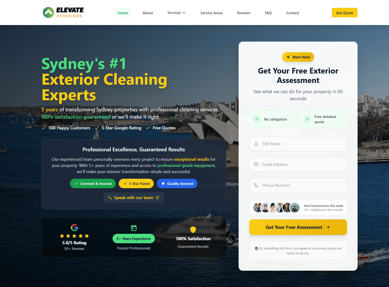
This is exactly what we did for Switch Accounting (you can visit them at switchaccounting.com.au). They went from a digital business card to a professional online presence that generates qualified leads every week. The hero was the turning point.
Most websites fail here. They:
- Bury the offer below the fold
- Use jargon only their competitors understand
- Show three competing CTAs ("Learn More", "Book Now", "View Pricing")
- Assume the visitor already knows who they are
Your above-the-fold section is not a brand statement. It is a conversion machine. Every pixel must earn its place.
The Offer Architecture: One Path to Yes
After the hero, your visitor is either convinced or leaving. The ones staying need a clear path forward.
A converting website has a single offer staircase:
Step 1: The Free Entry Point. This is not "Subscribe to our newsletter". It is something of immediate value. Examples: free audit, free consultation, free checklist, free proposal, free assessment. This step is about permission and qualification. You are learning whether they are a fit before they talk to a salesperson.
Step 2: The Conversation. An email or phone call. Not a hard pitch. A proper discovery call that listens to their problem and diagnoses the gap. This is where you build trust and qualify them further.
Step 3: The Proposal. A tailored plan with scope, timeline, and investment. Not a generic price list.
Step 4: The Partnership. Onboarding, delivery, ongoing support.
The mistake most websites make is skipping Step 1. They ask for a sales call on the homepage. Friction is too high. Your visitor is not ready.
This is what Elevate Exteriors (visit them at elevate-exteriors.com.au) did differently. They led with a free site audit instead of asking for a $2,000 quote. Lead volume jumped. Decision quality improved. Sales cycle compressed.
Your offer staircase should answer these questions:
| Question | Your answer |
|---|---|
| What is the free first step? | A free audit, consultation, or assessment |
| How long until they hear back? | "Within 1 business day" |
| What happens on the call? | "A 20-minute discovery to diagnose the gap and recommend next steps" |
| What is the investment? | "Custom per project. We'll outline the plan before asking for a commitment" |
| What is the timeline? | "Most builds take 8 to 12 weeks. Custom work takes longer" |
A converting website never asks for money before a conversation. Build the relationship first.
Trust Signals: Why They Click Yes
Conversion is not about persuasion. It is about removing doubt. Your visitor is asking: "Are these people legit? Do they know what they are doing? Will I regret this?"
The websites that convert best answer all three questions visibly on the page.
Social proof. Client logos. Review ratings. Testimonial quotes with photos and names. Case studies with numbers. Example: "We helped 47 clients grow 30% in the first 12 months" is more powerful than "We are experts in growth".
Proof of work. A portfolio section showing past projects. Before-and-after metrics. Client results. This is why case studies are mandatory on a converting website. Visitors want to see the work before they talk to you.
Credentials and guarantees. Years in business. Industry certifications. Guarantees (e.g. "We guarantee a 10% boost in conversion rate within 90 days or your money back"). These shrink the risk in the visitor's mind.
Specificity. Vague claims hurt more than they help. "Industry-leading expertise" does nothing. "Built 200+ Australian websites in 8 years, 80% in the trades and services sector" works because it is specific and believable.

We applied this with RyRo Loan Centre (visit them at ryroloancentre.com.au). The new site showcased their client results: 22 leads in 90 days, zero paid ads. That proof point moved more visitors to the application form than any testimonial could.
The websites that fail do the opposite:
- No client logos or case studies visible
- Generic testimonials with no photos or names
- Vague taglines ("We are your trusted partner")
- No specificity about what you actually do or who you serve
Your trust section should live early and repeat. Visitors need to see proof before they scroll past the hero.
Technical Foundations: Speed, Mobile, and Accessibility
A beautifully designed website that loads slowly, breaks on mobile, or fails for accessibility-tools users converts zero. Technical debt kills conversion.
Page speed matters. Google ranks faster sites higher. Visitors abandon sites that take more than three seconds to load. You lose 7% of conversions for every extra second of load time. If your site takes five seconds and a competitor's takes two seconds, your competitor wins.
Audit your site at PageSpeed Insights. Target 90+ on mobile and 95+ on desktop. If you are below 80, your website is leaking leads.
Mobile must work perfectly. 65% of web traffic in Australia comes from mobile. If your website is not mobile-first, you are designing for 35% of your visitors and hoping the other 65% forgive the mess.
Test your site on an iPhone SE and a basic Android phone. Buttons must be thumb-sized (48 pixels minimum). Text must be readable without zooming. Forms must work one-handed.
Accessibility is not optional. Screen-reader users, keyboard-only users, and colour-blind users should be able to navigate your site. This is a legal requirement in Australia under the Disability Discrimination Act.
Basics:
- Images have alt text describing the content
- Buttons and links have descriptive labels (not "Click here")
- Colour contrast meets WCAG AA standards (4.5:1 for text)
- Forms have clear labels and error messages
- Keyboard navigation works throughout (tab, enter, arrow keys)
A converting website does all three. If you skip any, you are leaving money on the table.
Conversion Tracking: Know What Actually Works
You cannot optimise what you do not measure. Most websites have zero visibility into which pages, buttons, and forms drive conversions.
Set up tracking for:
Page visits and flow. Where do visitors come from? Which pages do they visit in order? Where do they drop off? Tools: Google Analytics 4, Hotjar, Microsoft Clarity.
Form submissions. Which form converts best (hero form vs sidebar form vs bottom CTA)? Which fields have the highest abandonment rate? Tools: form analytics built into your platform, Formstack, JotForm.
Goal completions. Phone calls, email enquiries, demo requests, consultation bookings. Track the full funnel from visitor to enquiry.
Time on page and scroll depth. If visitors are bouncing in under 10 seconds, the hero is not working. If they are not scrolling past 30%, the body copy is not compelling.
Our playbook is to track three metrics obsessively:
- Conversion rate. Enquiries divided by visitors. Start where you are (often 1 to 2%). Target 5 to 10% as you optimise.
- Cost per enquiry. If you are running ads, calculate the cost of each lead. If organic, track which channels (SEO, referral, direct, AEO) deliver enquiries cheapest.
- Enquiry-to-customer rate. Half of your visitors will be unqualified. That is normal. Track what percentage of enquiries become paying customers. This tells you whether your offer architecture is working.
When you have data, you can see which pages, buttons, and copy actually move the needle. You can then double down on what works and fix what does not.
Iteration: Data-Driven Design Wins
A converting website is never finished. It is a live experiment. Each month, you test one change, measure the result, and keep or discard based on data.
Common high-impact tweaks:
- Rewrite the headline. Specific beats vague every time. Test "How to grow your tradies business 30% in 12 months" vs "Growth solutions for tradies".
- Move the free offer higher. If it is below the fold, bring it above. Measure the conversion lift.
- Add a case study section. If you do not have one, add it. If you have one generic case study, add two more with different outcomes (e.g. "15 leads in 90 days" and "30% conversion uplift").
- Simplify the navigation. If your menu has more than 5 items, visitors get lost. Cut ruthlessly.
- Change the CTA colour. Test fuchsia vs teal vs green. Small changes move the needle more than you expect.
- Reorder the sections. If "How It Works" comes before "Why Us", flip them and test.
Each test should run for at least 200 visitors or two weeks, whichever comes first. One test per month is realistic. After a year, you have compounded 12 optimisations. A 5% conversion lift per month is a 60% annual gain.

This is why building a converting website and pairing it with SEO compounds so well. You bring qualified visitors to a page that converts them. Traffic up 3x and conversion rate up 2x equals a 6x return on investment.
If you want a tailored plan for your business, book a free audit. We will run the conversion diagnostics and show you where your highest-impact wins are.
A converting website is the foundation; SEO compounds it. We covered the compounding playbook for service businesses in our complete dental SEO guide and our SEO playbook for plumbers. The same logic carries across every service vertical.
Real client. Real results.
Elevate ExteriorsExterior Services
Website rebuild + SEO foundations. After a 4 to 6 month build phase, now generating 15 to 20 qualified leads per month from organic search. No ad spend, lead quality consistently higher than paid traffic.
Quick answers
Frequently asked questions
Tagged with
Written by
Guru, Founder at Vynlox
Sydney based · 8+ years building websites · 100% client retention
I started Vynlox after watching too many good Australian businesses get burned by agencies that send reports, not results. Every strategy call you book is with me directly. You won't be handed off to a junior. You work with me.


